


Rebranding? Relaunching? New the the scene? Likely, you're going to sort through logo comps from a designer, but you'll do so without any really idea about how to choose the right thing. You'll look with your feelings or with your gut response. But, you won't inherently use logic or business sense in choosing the right logo.
Deciding on a logo can be difficult. I like to discuss logos in the same way I do soul mates. It's popular in America to discuss finding a life partner as a soul mate (as if there is one person somewhere on the earth that each of us is destined to find and fall in love with). Logos can have the same fairy tale idea about them: we expect to have a WOW moment as soon as we see the absolute perfect logo. We're waiting for things to "jump off the page," or we expect some kind of deep connection to a logo comp.
This will not happen. I guarantee it. Logos, especially for business owners, become a deeply personal choice. They feel like a visual representation of our vision, our success, our dreams...
Three Steps to Choosing the Right Logo
I beg of you, instead of reviewing those logo comps and expecting to find a soul mate, review them with these three things in minds:
1. Is it simple?
Simplicity is the difference between a logo and a picture. My rule? The logo has to be usable in one single color. If it requires multiple colors to see overlapping elements or details, then it’s not a logo -- it’s a picture.
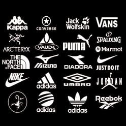
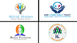
Compare these logos
Compare these shoe brands on the left, to these nonprofit brands on the right. The shoe brands very easily sit in white. They are clear, simple, and work in a single color.
The nonprofit brand comps are incredibly complicated. Many of them would not work well in a single color. I would identify those as pictures, not a logos.

2. Is it readable?
Logos are typically viewed at a relatively small size. Your icon or word mark need to be readable and identifiable at a very small size. The logos above make the same point. How many of the shoe brand logos can you read at a small size? And, how many of the nonprofit logos can you read (or even identify) at that same small size?

3. Is it memorable?
Branding has never been more important. Logos, on the other hand, are becoming less and less important. What I mean is this: the ethos and lifestyle of a brand is what drives the actual logo to be memorable. People remember the concept of Nike's "Just Do It" tagline, or the fun and family-filled experience of McDonald's restaurant, before they remember what the actual logo looks like.
Think of one of your favorite current brands -- something that hasn't been around for more than ten years. You know what you get from them, and you know why you love them, but you'll have a hard to recollecting the shapes in their logo. We're in logo overload as a globe!
Nevertheless, it’s still important to be as original as possible with the imagery in your logo. Don’t settle for a Fiverr, dime-a-dozen, just-like-everyone-in-your-industry logo.
When you Google your industry, you'll find a page that looks something like this...
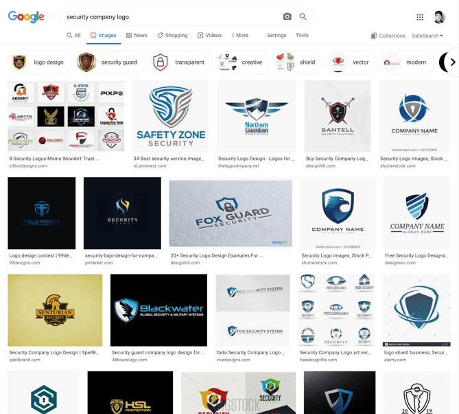
Don't be another shield, if you provide security services. And don't be another cross if you're a private Christian school. Avoid check marks if you prepare taxes, and say NO to another circle if you are a managed services provider. Be original -- it can only help you.


.jpg)
.jpg)