It's an early childhood lesson - share your toys and play nicely with others. Amidst all of the valuable information available to every consumer online, there are some who haven't learned to share. They will provide a paragraph of the information that you wanted, but after that...
...you have to provide some contact information if you want to read the rest. It's almost click-bait, and it is popular among website personalities that believe their information is far more special than anything else that is available. What's the buyer response to this experience? They simply leave.
Here is the problem with the approach of requiring contact information to get information. The Internet has trained consumers and business buyers that information to answer their questions and evaluate their decisions is basically free.
The problem with putting up the "give us your email" gate too early, is that people don't have a way to evaluate whether the information is valuable enough to provide a name and email.
What's valuable enough to trade for my contact information?
This is not to say that there is no information valuable enough to require a contact submission. Of course, lots of things are that valuable. But there has to be a balance between what is open to everyone, and what is worth trading personal contact information to view. That view is not in your eyes, but in the eyes of your buyers.
A simple way to evaluate what should have a contact information gate requirement is to ask, "Could I easily get this information somewhere else?"
If the buyer knows they can simply put a new search back into the search bar, and get what they were looking for, they probably will. And if you force this issue in a way that does not leave them with a sense of value, they will give you contact information, but it will be their spam address. The "I never look at this" email they give to all advertisers. You'll get contact info, but it will only fall into the bucket of the unseen.
A Story Example
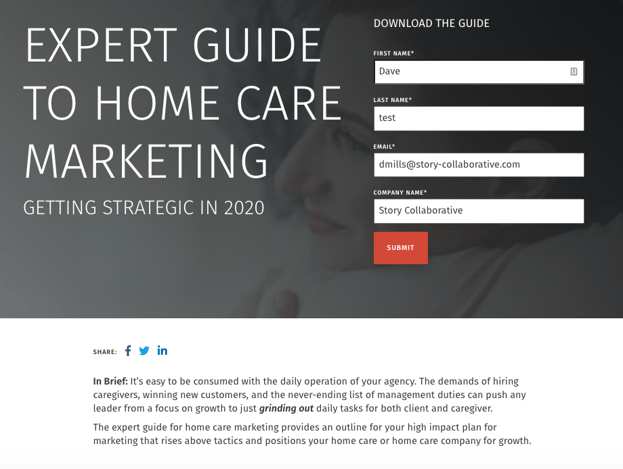
Here is an example of a decision that Story Collaborative made about a guide that we have published. This is valuable information that required research and shares some of our experience in working with Home Care marketing. We could have put this behind a gate and required a form completion. Instead we put it in the open, and simply created an optional download version of the page for those who appreciate the content. View the Expert Guide to Home Care Marketing
Here's what is important and what will help you cure your website's "what's mine is mine" personality: Ask yourself how people will feel about their relationship with your organization once they've provide contact information. The page above is open for anyone who wants to read it, but if they think it is valuable, they can get a PDF version as a download. We think it creates value, and that's how people in the home care industry have responded.
Look at these areas:
Pricing
One area where this is especially true is in the disclosure of pricing information. Many people will leave a site that does not offer pricing information. I often see sites that ask me to make an appointment to discover their pricing. What does that tell me? Mostly, that I need to look somewhere else that is a little more transparent. It is only after the value is established that I will fill out a form and have a conversation.
Educational Offerings
Many educational organizations make inquiry and admissions forms their primary initial contact method. The inquiry form often looks and feels just like an admissions form, and creates a massive barrier before value is established.
What If I want to Chat?
Some people really don't want to talk on the phone. Like all millennials for example. They'd much rather chat, use Facebook messenger, or even text. That can be a welcome alternative to a form. And it is also a way for you to deliver information to them that is much more personal. But, don't withhold information until they chat - just chat when they are ready.
One big thing that you can do to Help your website
Take a hard look at the content on your website to review its value within your industry. Is your website offering information that is unique or special, or is it mostly things that people would expect to be able to access if they were interested in your product or service. If that's the case, then don't require a login or contact form. If you want to capture leads, decide that you'll invest in the creation of content that is a step above that - truly valuable and unique. Then you can do as we've done above, or you can use a form requirement.
Remember the 15 second rule - you have 15 seconds to demonstrate value. If you don't connect in that brief moment, your visitor has moved on. At Story, we use a
website planning process to identify and cure the challenges that we've outlined above.


%20(1).jpg)


